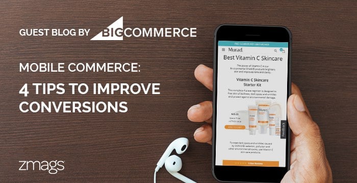
Mobile Commerce: Easy Fixes to Remove Common Conversion Obstacles


Jessica is an integrated marketing leader specializing in strategic B2B and B2C enterprise solutions.
Amanda Farmer
BigCommerce Marketing Strategist and Writer
The proof is in the numbers: online shoppers have come to expect a seamless mobile commerce experience that is equivalent in ease-of-use, design, and personalization to what they would receive on desktop or even in-store. According to BigCommerce , if your site isn’t responsive, an estimated 75% of people will leave without converting due to frustration and a lack of brand trust. BigCommerce estimates another 35% of customers shopping on mobile devices will abandon their cart if they are forced to create an account in order to check out. While these numbers alone make an impactful statement on the importance of upping your mobile commerce game, consider this additional stat: In 2016, mobile sales made up 31% of revenue for BigCommerce-powered stores. That’s a lot of money to be made — or forfeited — solely based on your site’s mobile experience. The good news is, the tools and technology you need to create a smooth, engaging mobile commerce experience already exist and are attainable for merchants of all sizes, should you choose to employ them. But first, it’s important to understand the common mobile site issues that make customers leave the site without purchasing.1. Long site-loading time
It’s no secret today’s online audience has a short attention span, but you may be surprised just how brief it is. According to KissMetrics , 40% of mobile device users will abandon a site if it takes more than three seconds to load — meaning this is one first impression you can’t afford to get wrong. Use your analytics tool to see how long your site currently takes to load. If it takes longer than three seconds, there are a few ways to get it up to speed, including reducing file and image sizes and enabling browser caching.2. Images and pop-ups don’t properly fit screen
Pop-ups can be a useful tool for alerting visitors to promotions or earning more newsletter sign-ups, but if not sized correctly for smaller screens, they may simply inspire visitors to leave. In general, pop-ups are best left to desktop experiences, but if you decide to use them on your mobile site, be sure visitors can easily exit them. Images on each page, particularly your home and product pages, should also be optimized to fit smaller screens so they don’t take up the entire real estate of the page. But just because your content is on a smaller screen, doesn’t mean it should be any less engaging than your desktop experience. Make the most of your imagery by creating rich content. Whether it’s a buying guide, how-to product video or shoppable lookbook, your rich content should be just as interactive and engaging on a mobile device as it is on desktop.
3. Lack of clear calls-to-action
Using buttons and other clearly defined calls-to-action is important for any type of web design, but especially with mobile experiences where text is smaller and there’s less content to guide customers through an experience. Consider what path you want users to take on each page of your site, then guide them down that path with large, easy-to-click buttons. For example, you may care most about getting users to sign up for your newsletter on your homepage, while a large checkout or add-to-cart button should take priority on individual product pages.4. Lengthy checkout process
Remember that three-second window you have to retain users while your page loads? Unfortunately, there’s not much of an improvement in customer patience during the checkout process. Entering payment and shipping details on small screens is tedious, but you can compensate for this by adding digital wallet options, such as Apple Pay, PayPal, and Amazon Pay. This allows shoppers to check out with a single click or touch of their thumbprint, automatically transferring shipping and payment details from trusted third-party sites. Simply adding these options has been shown to improve conversion by up to 10% upon launch and can increase mobile conversions by up to 3x overall . If you’ve been neglecting your mobile experience, you are undoubtedly missing out on a huge — and growing — customer base. Today’s shoppers value convenience overall, and neglecting to meet them where they choose to shop is a fast way to lose customers and revenue to your competitors. View the recent ebook from Zmags, “Small Screen, Big Content: Making Mobile Count,” to discover how mobile shoppers differ from their desktop counterparts. Plus, you’ll find in-depth strategies and design tips for tackling these issues.
About the author: Amanda Farmer is a BigCommerce researcher and copywriter. She is also the principal at Dreamtown Creative, a marketing firm working with Fortune 500 companies to grow revenue through online initiatives and campaigns. Her deep understanding of branding, content marketing and storytelling across a wide variety of platforms has won her multiple awards, including placement as a Screenplay Competition Finalist at the Austin Film Festival.